A logo is the first thing people remember
Logo design for clients across different sectors — beauty, services, jewellery
3
Logos
3
Sector
100%
Vector
Three different briefs, three different sectors, three different visual languages. Logo design requires the ability to listen to the client, understand the competitive context, and find a solution that is recognisable, scalable and lasting.
UNICA Beauty & Wellness
Logo for a beauty centre.
Brief: elegance, femininity, modernity.
Solution: minimalist lettermark with circle — the “U” becomes both symbol and geometry. “Beauty & Wellness” payoff in a light typeface to balance the weight of the symbol.
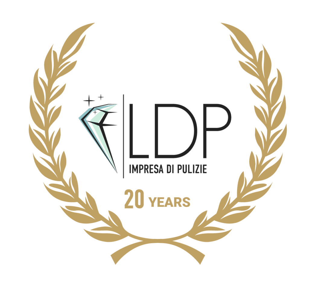
LDP Service — 20 Years
Anniversary logo for a cleaning company’s twentieth year.
Brief: convey prestige and solidity while maintaining the existing brand character.
Solution: gold laurel wreath with the company logo at centre — visual language that communicates milestone and trust.
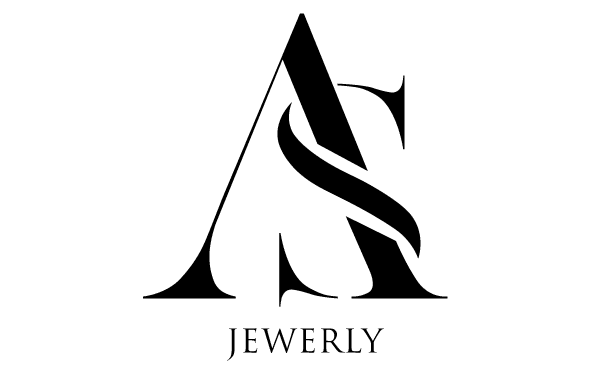
AS Jewelry
Logo for a jewellery brand.
Brief: luxury, exclusivity, sophistication.
Solution: “A+S” monogram in editorial serif style, with the two letters interlocked in a unique composition. Black background for maximum contrast and visual impact.
What this work demonstrates
Ability to adapt visual language to radically different sectors and target audiences. Full logo system design (symbol, positive/negative versions, use variants). Typographic sensibility applied to visual identity.
Next project → Technical Illustration
Adobe Illustrator · Adobe Photoshop